Borras rebranded
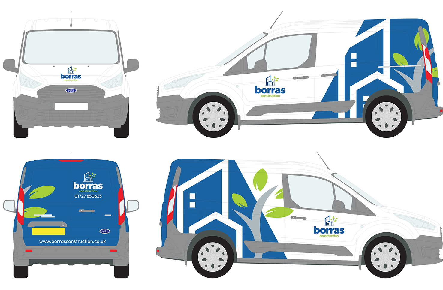
We’re excited to announce a new look for our business to incorporate signage, clothing, van livery, and stationery.
This is a case of evolution over revolution – we’ve kept our Borras blue, recognised for its reliability and traditional values.
And for the first time, our logo incorporates an icon: two buildings adjacent to a tree in leaf, intended to demonstrate our commitment to our sustainability goals and the communities we serve with projects large and small. The inclusion of a fresh green colour is another nod to our sustainability priorities and our healthy growth as a company over 45 years.
And you’ll notice the lower-case ‘b’ for Borras. This design choice has sparked some debate at headquarters, as company names are typically regarded as proper nouns. However, we believe we are in good company—brands like Mastercard, Dyson, eBay, Adidas, Amazon, and BP all use lowercase typography for their logos. We hope this conveys our confidence in sharing our name, rather than shouting it from the rooftops.
This approach also reflects our desire for approachability. We want our clients to see us as colleagues with whom they can easily communicate about their project needs and challenges.
Our rebranding is an opportunity to reaffirm our values to the industry, our colleagues, customers and partners. Our new brand is smart, bright, and confident, just like our people, while also being accessible and approachable.
While you’re here, feel free to explore our newly designed website!
